Something we did very early on in the project was come up with a band name and design our logo so that we could use it across all our production work. This also meant that we had a set colour scheme, consistent across all our project work. The original logo design was this:
However, a few weeks in we felt that the logo just wasn’t edgy enough. The pink lipstick smudge was girly enough, and the font was just a bit too sophisticated and reminded us too much of a girl pop group. For this reason we changed the font slightly to give it more of a rough, ‘rock’ look, and all three of us were immediately much more pleased with the result:
With this logo and colour scheme in mind, we incorporated the logo into our music video, so the logo we painted onto the wall would be the same logo our fans would recognise on our website, album cover and all other products, creating a strong brand identity. The logo also helped us decide on the paint we would need for the music video, as we would be painting the logo on the wall: black, white and bright pink. This meant that all the paint shots showed these three key colours, so our whole video is consistent with our colour scheme:
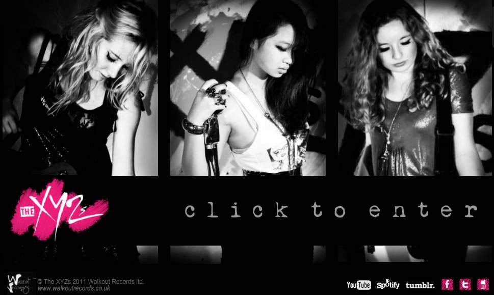
This also spurred us to use a pink-tinted colour grade using Adobe After Effects. We also of course stuck to this colour scheme when designing our website, sticking to black, white and pink throughout:
We also tried to keep our band image similar across all platforms, as we need fans to know that we are a sassy female rock group who play their own instruments. This was fine throughout the video, as our performance shots were based on how we would actually perform at a concert, dressed girly (high heels, pretty makeup, glitter) but rocky (dark nail polish, dark clothing, silver and black jewellery). However, we decided to make our promotional shots more sophisticated and glamorous. After selecting a shot and starting to design our album cover, we were concerned that we had lost our image and that a passerby noticing the album cover would assume we were simply a girl group like The Saturdays:
After playing around with effects and different fonts, and discussion with our teacher, we all agreed that we should just use a shot taken during our music video shoot. The one we chose sums up our band like we thought it should: we have attitude, a slightly edgier style, and all three of us were happier with our appearance in this shot:
This meant that we could still use the more sophisticated shots, but inside on one of the sleeves instead. The rest of the panels were edited using our pink, black and white colour scheme to stick to our strong branding.
- There are several instances where our products are connected in other ways:
- The album cover features our QR code which links directly to our website
- Our website shows our album cover on the homepage and has links to purchase it
- There is a ‘watch’ page on our site where our music video can be viewed
- The gallery features all the photos from our music video and from our album cover
- Shots from our music video shoot are used in our album designs so fans will recognise them
Our online competition also sticks to our colour scheme to the extent that even the perfume we are collaborating with is pink and black. The promotional poster we edited ourselves into is also these colours, and Charley even wears Tommy Hilfiger dungarees in our video, an example of subtle product placement for the company that we would have a symbiotic relationship with as part of said competition.


No comments:
Post a Comment