Hello, thank you for taking the time to look around both my individual blog and my Group Blog.
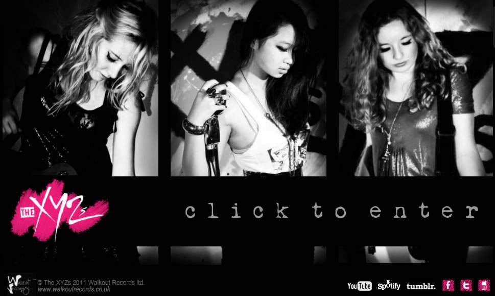
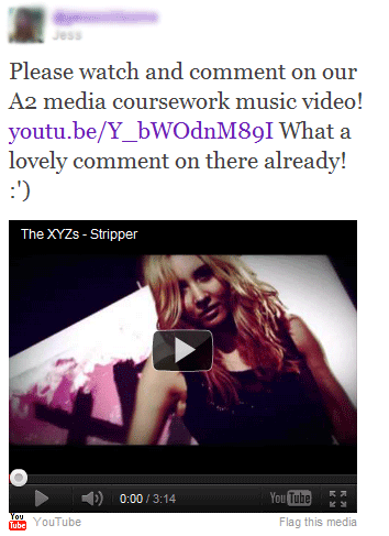
Firstly I invite you to watch and hopefully enjoy our music video for 'Stripper' at the top of the page. Underneath that, you can click the printscreen saying 'click to enter' which will take you to our band's website. Next to that you will see our album cover, which you can click to enlarge.
You will find both links to the group blog and the main teaching blog (which has links to all the other individual and group blogs at my centre) to the right of the page. There is also a list of tags and my blog archive so you can easily navigate my posts, as well as a search bar.
On this blog you will also find any independent research I undertook, my individual initial idea and of course my answers to the four evaluation questions. You can check out any work I did for my preliminary task, including the evaluation.
On my Group Blog you will find the work I individually contributed towards the development and production of our music video by clicking on the tag labelled 'Jess', along with all the work our group produced together as a team.
All posts are organised chronologically, dated from June before the summer holidays (prelim task) up to December of this year (main task).
I hope that both my individual and group blog are simple and fun to browse, and that our production tasks positively reflect all of mine, Charley's and Odelia's hard work this year.
I've really enjoyed working on this project and getting to live the rockstar life for a brief time. I hope all our hard work is reflected in our finished music video and ancillary tasks.
1. In what ways does your media product use, develop or challenge forms and conventions of real media products?
MUSIC VIDEO We decided quite early on within the group that in order to create the most effective music video we would stick to the traditional convention of being half-narrative, half-performance. This is a tried and tested format and works for a fairly mainstream audience (as we are targeting). It is especially effective for a debut video as viewers can see and get to know the band and their image, but the narrative element makes it much more exciting to watch and adds more depth.
One convention we really wanted to challenge in our music video was the stereotypical portrayal of women. Although we recognise that with the voyeuristic element to our video, we are still sexualising the women in the video, as they are clearly being watched by both the man in the video and the viewer at home. However, the difference is that we soon find that they are in control, and it is the man who ultimately is punished for his voyeuristic ways, and it turns out that he is the one doing the stripping; the women are just doing their job. After research into empowering women in music videos, we agreed that as an all-girl group we wanted to do something similar, which is where the idea came from. Once decided on the song ‘Stripper’, we didn’t want to do the obvious and set the video in a strip club as Soho Dolls originally did:
I found that strip-club-style videos were very common in the Hip-Hop and R&B genres, for example in Enrique Iglesias and Usher’s ‘Dirty Dancer’ video, the only female presence in the entire video was a stripper being watched by the male artists:
Often the women are wearing very little clothing and we don’t even see their faces, completely objectifying their bodies as men simply watch and enjoy. For this reason, we wanted to take this convention and give it a twist: the man in this video will be humiliated for unprofessionally leering at the girls he is supposed to be supervising.
I also explored these characteristics in other genres, as our style is of course not R&B or Hip-Hop so perhaps the conventions were different. Although not as common, there was still the objectification of women in rock videos, especially in all-male bands (as most are). For example, All Time Low’s song ‘Dear Maria, Count Me In’ is about a stripper, as our song is, but they did the obvious video by making it simply the band watching said stripper in a bar, which we did not want to do:
Instead we took inspiration from strong, empowering females like Charlie’s Angels; they are powerful and dominant over men but still manage to be attractive and likeable to both genders. In this clip from the film, the women are performing in a strip club but use the trancelike state of the men watching to their advantage by stealing their wallets. This inspired us as in our video we manipulate the hopefulness of the men to make a fool out of him. We were also going for quite a filmic quality so this scene was great to aspire to:
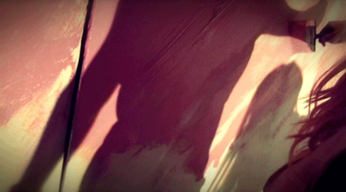
However, they are dressed very provocatively and literally look like strippers, and we wanted to be more subtle than that and wanted to preserve our dignity. I did particularly like the way that the scene opened with close-ups of body parts and recognised that we wanted to open our music video in a similar way, as the extreme shot type immediately captures the attention of the viewer and gives a sense of enigma as we can only see a tiny part of the scene:
The strip club scene in Charlie's Angels
Some shots from the opening of our Stripper music video
In terms of genre and style conventions, it is quite hard to compare our video as there aren’t many girl rock bands to compare to. One band we did do a lot of research into was The Plasticines as they are all-female and have a rocky yet pop-mainstream sound, and they play their own instruments.
For their video ‘Barcelona’, they use a lot of pink to style and edit the video, with pink hues to give a fun, girly feel. We used a magenta-toned colour-grade on our music video, and put certain parts in black and white as they did:
The band are styled in quite a glam rock way and are shown playing their own instruments throughout the video, so we took inspiration from them and stuck to these conventions of a female band. However, their video is entirely performance so to make ours different we added a storyline too as we found the ‘Barcelona’ video quite boring after a while:
For the end of our video we liked the idea of painting our logo on the wall, as it went with our narrative and could be used as a backdrop for the performance:
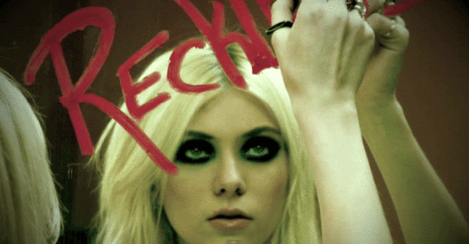
We found some other artists’ videos who also write their band name in their video to create a strong brand, and this was particularly a convention of debut videos, like ours, as the viewer will not necessarily recognise the band so they need a visual hook to help them remember the name. For example, in The Pretty Reckless’s debut video for ‘Make Me Wanna Die’, the lead singer writes the band name on a mirror in lipstick:
Of course we also followed many basic music video conventions, noted by theorists like Andrew Goodwin, such as:
More screen time for the lead singer
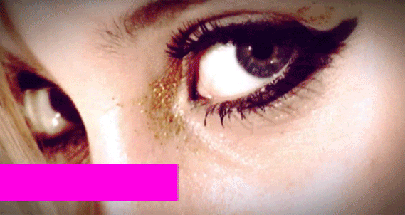
Beauty Shots
Equal screen time for both guitarist & bassist
Star motifs – repeated shots of the band
Cutting to the beat of the music
Discontinuity & extremes – cutting from wide shots to very close-up shots
Lip-singing & instrument playing
Relationship between lyrics and visuals
Visual trademarks/motifs e.g. our band logo, close-ups of mouths singing ‘You can call me X’, etc.
Reference to the notion of looking & voyeurism – particularly important in our video
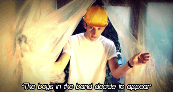
An example of visuals relating to the lyrics - Josh is not actually in the band, but we do have a boy appearing at the same point as the singer says these words
A beauty shot of our lead singer, a shot type used in most music videos, especially commercial ones
WEBSITE
When starting to create our website, the first thing we did as a group was look at real artists’ websites (such as The Veronicas, a fellow girl band) to learn the conventions and provide a basis for what we need to put on there. Some “key ingredients” of a band website include:
Fan interactivity
Merchandise
Videos
Playable music
News
Purchasing opportunities for the music
Tour dates
Gallery
Artist biography
One main thing we did differently was create a fixed flash-style website rather than a scrolling one, as most websites are, as we thought it was neater and looked more contained.
Paramore's scrolling site
Our fixed flash website
A key feature of most band sites was interactivity, so of course we included a Twitter feed, plus links to several other social networking sites including Facebook and Tumblr. We also ensured we had links to YouTube and Spotify so fans can listen to our music elsewhere. Also, many sites have a forum or comment box so that fans can interact with the band, but as a fairly small, new band we thought we would do our main fan interaction through Social Networking sites, as fans are more likely to ‘tweet’ the members than try and reach them through their official forum nowadays.
After looking through lots of websites for artists with similar genres to ours, I particularly liked the grungy style of Avril Lavigne’s as it was rocky as well as still being quite girly. The font on her site was perfect for what we were going for, so we used a similar font on our own site.
Although we could only find one example of a competition directly shown on an artist’s website (Ed Sheeran's), we thought that it would be a great way for fans to get involved and get something out of being a fan of The XYZs, and if it went viral it would hopefully make people take notice of our band and site.
DIGIPACK
For our album cover we followed most conventions, for example use of a mid-shot of all three of us (lead singer in the middle) with a clear album title and even larger band name. We followed the conventions of other girl rock bands, using direct address and quite serious, sultry shots.
We ensured to place all relevant institutional information, like record label, website and copyright, on the back cover as well as the album track names and a few more smaller photos, which is quite standard for a debut album. The two inside panels left more room for creativity, and we decided to use more sophisticated photos on one side to show a different side to the band, using lots of close-ups like many female groups do to focus on their appearance, unlike the back cover shots which show our instruments and look more edgy.
2. How effective is the combination of your main product and ancillary texts?
Something we did very early on in the project was come up with a band name and design our logo so that we could use it across all our production work. This also meant that we had a set colour scheme, consistent across all our project work. The original logo design was this:
However, a few weeks in we felt that the logo just wasn’t edgy enough. The pink lipstick smudge was girly enough, and the font was just a bit too sophisticated and reminded us too much of a girl pop group. For this reason we changed the font slightly to give it more of a rough, ‘rock’ look, and all three of us were immediately much more pleased with the result:
With this logo and colour scheme in mind, we incorporated the logo into our music video, so the logo we painted onto the wall would be the same logo our fans would recognise on our website, album cover and all other products, creating a strong brand identity. The logo also helped us decide on the paint we would need for the music video, as we would be painting the logo on the wall: black, white and bright pink. This meant that all the paint shots showed these three key colours, so our whole video is consistent with our colour scheme:
This also spurred us to use a pink-tinted colour grade using Adobe After Effects. We also of course stuck to this colour scheme when designing our website, sticking to black, white and pink throughout:
We also tried to keep our band image similar across all platforms, as we need fans to know that we are a sassy female rock group who play their own instruments. This was fine throughout the video, as our performance shots were based on how we would actually perform at a concert, dressed girly (high heels, pretty makeup, glitter) but rocky (dark nail polish, dark clothing, silver and black jewellery). However, we decided to make our promotional shots more sophisticated and glamorous. After selecting a shot and starting to design our album cover, we were concerned that we had lost our image and that a passerby noticing the album cover would assume we were simply a girl group like The Saturdays:
After playing around with effects and different fonts, and discussion with our teacher, we all agreed that we should just use a shot taken during our music video shoot. The one we chose sums up our band like we thought it should: we have attitude, a slightly edgier style, and all three of us were happier with our appearance in this shot:
This meant that we could still use the more sophisticated shots, but inside on one of the sleeves instead. The rest of the panels were edited using our pink, black and white colour scheme to stick to our strong branding.
There are several instances where our products are connected in other ways:
The album cover features our QR code which links directly to our website
Our website shows our album cover on the homepage and has links to purchase it
There is a ‘watch’ page on our site where our music video can be viewed
The gallery features all the photos from our music video and from our album cover
Shots from our music video shoot are used in our album designs so fans will recognise them
Our online competition also sticks to our colour scheme to the extent that even the perfume we are collaborating with is pink and black. The promotional poster we edited ourselves into is also these colours, and Charley even wears Tommy Hilfiger dungarees in our video, an example of subtle product placement for the company that we would have a symbiotic relationship with as part of said competition.
3. What have you learned from your audience feedback?
We posted an online survey for people to fill in after watching our video, and got a good range of answers from teenagers aged between 14-20 and both males and females.
It was also reassuring to learn that 91% of people surveyed could imagine our video on a real music video, which meant that it must look quite professional.
83% of people said that if The XYZs were a real band, they would probably like them, based on our video. This means that our video markets the band well and is appealing to a mainstream teenage audience.
We also got some feedback from fellow A2 media students, as not only were they teenagers and therefore in our target market (though there was only one girl, so the boys were all in our secondary market) but they would be able to give slightly more technical criticisms.
Overall the main more negative comments were based on the storyline; many people felt it was either hard to follow or a little weak. However, in the discussion many agreed that it doesn't matter too much, as it is a music video rather than a film or television narrative, and therefore it is more about the whole package, but if we were to make this video again I think all three of us would make sure that our storyline was more solid and clear to the viewer. The discussion group also mentioned that perhaps Josh was miscast in the role as it might have made more sense if the builder was an older, podgy, slimy-looking guy, as then it would seem more creepy and he would be more unlikeable to the viewer, putting them further on the girls' side.
I was especially pleased by this comment on our YouTube video:
I was pleased to learn that our edgy editing and colour grading made our video more 'dymanic' rather than 'degrading' it, and that ours is one to aspire to for 'quality and authenticity to a genre'. This signifies that our video does look like a real artist's video, and that it fits the genre, which is reassuring to hear.
4. How did you use new media technologies in the construction and research, planning and evaluation stages?
To construct our music video, we used a video camera new to us all called a Sony HDV 1080i 3CMOS. We had previously not used a camera anywhere near as big as this for a media project so it was great to be able to try a new style of equipment.
This year we also used a new version of Adobe Premiere called CS5 which took a little getting used to as it was arranged slightly differently to the previous version used on last year's project. I personally now feel a lot more comfortable with Premiere as in previous projects there were more group members so I didn't get as much of a chance to edit.
We also used Adobe After Effects for the first time to colour grade and add effects like a vignette to our music video. I learnt how to use 'Curves' in order to play around with the brightness and contrast of a clip to make it look as professional and exciting and exciting to watch as possible.
Here is a video demonstrating our use of Adobe After Effects:
Designing our website was a new experience for all of us, as we had never used Wix before, and one that I primarily took charge of as part of our production work delegation.
The homepage was particularly challenging as we had to combine the software's own functions with custom HTML boxes for our social network links.
In order to keep up with the proliferation of mobile technology, as personally knowing that much online browsing is done via mobile nowadays, especially amongst teenagers, we decided to make use of Wix's 'make a mobile site' function.
We also made a QR code to place on our CD cover, website and possibly other products. Fans simply scan the barcode with their smartphone and will instantly be taken to a listen of The XYZs' links. In order to check everything worked, I used my own smartphone and barcode reading software.
Here is our QR code (feel free to scan - it works!):
Here is a short video demonstrating the barcode and our touch-screen website:
Throughout the research and planning stages of the project, we communicated amongst the group using several different forms of new media technologies. This included online social networks and smartphone applications like WhatsApp to ensure all three of us were always up-to-date with each other:
We did lots of online research, including using Spotify, YouTube and Last.fm when searching for a song to use by genre, style and similar artists.
Throughout the evaluation stage of the project we utilised Web 2.0 to distribute our video and gain audience feedback. Firstly we held a screening of all 6 groups’ music videos in our school studio one lunchtime. We generated interest by posting a teaser trailer including all the videos on the school intranet homepage and on Facebook. We also created an event on Facebook and all three of us invited everyone we knew we to our school to invite them to come and watch our video:
We all also posted the video link on our personal Twitter and Tumblr pages in order to receive more feedback from outside our school and beyond the friends we knew personally, hopefully giving us more honest feedback:
This is the greatest advantage of using Web 2.0 to a standard viewing and questionnaire at school; there is potential to reach a worldwide audience, and we in fact received responses from Switzerland and Canada.
Audience members who clicked on the video could then comment below the video, which was one way we received feedback. We also created an online survey using the website Surveymonkey: http://surveymonkey.com/s/qpqsl96
The site allowed us to read responses based on age, gender and music taste so we could pinpoint our target audiences and read their responses, and of course find out any improvements people think we should have made so we could evaluate effectively. It was a lot more simple and productive to use this site than hand our paper questionnaires, as results were instant and we could easily analyse all our results on one page without having to collate the information ourselves.
I found a band called Alice in Videoland who are electro/punk/rock and have a female lead singer, similar to our music video genre and style, so I chose to look at one of their music videos using Goodwin's textual analysis theory. The video is nearly all performance based, with the part concept of falling buildings and floating clouds in the background making it more interesting, asides from the obvious stylistic feature of being animated.
Alice in Videoland - She's a Machine
Genre Characteristics
Although the video is quite unconventional in that it is entirely animated, there are still rock-genre signifiers. There are several close-ups of the band's instruments and amps, showing off their musical skills (although it is not actually them, the conventions remain the same as that of a normal video).
We also see a wider shot of the (animated) band themselves performing with their instruments in quite a conventionally set-up way, like we would find in many rock videos. As well as the guitarist and drummer, we also see a keyboard player with synths, pointing to the more electro-element the band have.
The clothing and styling of the cartoon band also heavily suggests rock, with their wristbands, converse-style shoes, leather jacket, and long, messy hair.
I also noticed the retro-style microphone shown in the video, very similar to the one we have in mind for our music video.
Relationship between lyrics & visuals
The video fits the feel of the song which is about a doomed relationship and the sense of disaster waiting for happen. There are lots of references to the song's lyrics throughout the video as lyrics are shown on-screen and the song name is shown on the keyboard.
There are also lyrics like 'She's not yours to keep, she don't belong with you' which suggests the subject of a strong, independent woman, working with the band image of being female-fronted. This is reflected in the video as the tough-looking frontwoman dominates the footage over the other male band members. This could be seen as quite empowering for woman, as the woman they are singing about obviously doesn't need a man to 'keep' her, a theme we are trying to display in our own music video.
Relationship between music &visuals
The cuts in the video often correspond with drum beats or changes in the music. At the more electro parts of the chorus, there is a cut on every synth sound so there are lots of flashing images reminiscent of being at a party or club dancing to this song. There is also a shaking effect put on the whole video so the screen seems to vibrate in time to the low bass guitar sounds, fitting the trembling and falling buildings in the background. The cartoon band and singer obviously play their instruments in time to the music so it is a fairly accurate representation of an actual performance the band might give. As the song continuously gains momentum, the cuts in the video get more frantic and there are more flashing images as the song seems to get louder and more urgent.
By the end the video is simply a series of flashing images, much like strobe lights or even some kind of hypnotic subliminal message, keeping the viewer transfixed to the screen before the climax of the song where it all calms down again for one slow shot of the band at the end so we are left with their image.
Are there close-ups of the artist and star image motifs?
Even though the video is an animation, there are still lots of CUs of the animated lead singer and other band members, and even beauty shots of her as we would expect in a normal video.
As this is not the band's debut video, they are able to use this cartoon version of themselves to carry on their branding, as their fans will already know what they look like from previous videos and will recognise these cartoons as representative of the actual members.
If we compare the cartoon version to the real band, they look very similar and it is clear that the animations were styled based on the actual clothing of the band, so fans will definitely recognise them and the video adds to their image and identity as it keeps with their style. They are also dressed mainly in black and white and photographed in front of a red and white background, suggesting that the colouring of the video is intentional and perhaps a running theme for the band, especially as the lead singer sometimes has red streaks in her hair.
Are there references to the notion of looking?
The lead singer is drawn wearing quite casual, not particularly feminine clothing, but her shorts are very short and there are still close-ups of her body. for example a tilt up her legs to her waist, showing how music videos can manage to have a sexualised, voyeuristic feel even when animated. One youtube comment says, 'she even looks hot as a cartoon', so the idea obviously works.
Are there intertextual references?
The anime-cartoon style of the video is obviously a huge intertextual reference as the band themselves probably like anime, or their fans do, or both, otherwise they would not have gone for such a video. Anime has a huge fanbase worldwide and not many music videos are made in this way, making it quite unique.
The background of falling and exploding buildings may be referencing popular disaster movies like The Day After Tomorrow, giving it an end-of-the-world feel.