

MUSIC VIDEO
We decided quite early on within the group that in order to create the most effective music video we would stick to the traditional convention of being half-narrative, half-performance. This is a tried and tested format and works for a fairly mainstream audience (as we are targeting). It is especially effective for a debut video as viewers can see and get to know the band and their image, but the narrative element makes it much more exciting to watch and adds more depth.
One convention we really wanted to challenge in our music video was the stereotypical portrayal of women. Although we recognise that with the voyeuristic element to our video, we are still sexualising the women in the video, as they are clearly being watched by both the man in the video and the viewer at home. However, the difference is that we soon find that they are in control, and it is the man who ultimately is punished for his voyeuristic ways, and it turns out that he is the one doing the stripping; the women are just doing their job.
After research into empowering women in music videos, we agreed that as an all-girl group we wanted to do something similar, which is where the idea came from. Once decided on the song ‘Stripper’, we didn’t want to do the obvious and set the video in a strip club as Soho Dolls originally did:

I found that strip-club-style videos were very common in the Hip-Hop and R&B genres, for example in Enrique Iglesias and Usher’s ‘Dirty Dancer’ video, the only female presence in the entire video was a stripper being watched by the male artists:

I also explored these characteristics in other genres, as our style is of course not R&B or Hip-Hop so perhaps the conventions were different. Although not as common, there was still the objectification of women in rock videos, especially in all-male bands (as most are). For example, All Time Low’s song ‘Dear Maria, Count Me In’ is about a stripper, as our song is, but they did the obvious video by making it simply the band watching said stripper in a bar, which we did not want to do:

In this clip from the film, the women are performing in a strip club but use the trancelike state of the men watching to their advantage by stealing their wallets. This inspired us as in our video we manipulate the hopefulness of the men to make a fool out of him. We were also going for quite a filmic quality so this scene was great to aspire to:
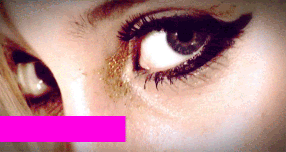
However, they are dressed very provocatively and literally look like strippers, and we wanted to be more subtle than that and wanted to preserve our dignity. I did particularly like the way that the scene opened with close-ups of body parts and recognised that we wanted to open our music video in a similar way, as the extreme shot type immediately captures the attention of the viewer and gives a sense of enigma as we can only see a tiny part of the scene:
 |
| The strip club scene in Charlie's Angels |
 |
| Some shots from the opening of our Stripper music video |
In terms of genre and style conventions, it is quite hard to compare our video as there aren’t many girl rock bands to compare to. One band we did do a lot of research into was The Plasticines as they are all-female and have a rocky yet pop-mainstream sound, and they play their own instruments.
For their video ‘Barcelona’, they use a lot of pink to style and edit the video, with pink hues to give a fun, girly feel. We used a magenta-toned colour-grade on our music video, and put certain parts in black and white as they did:

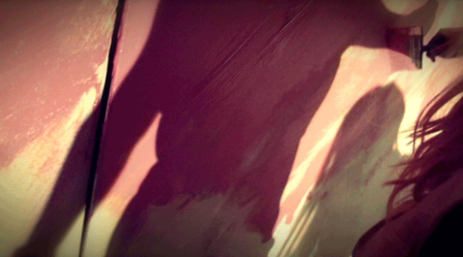
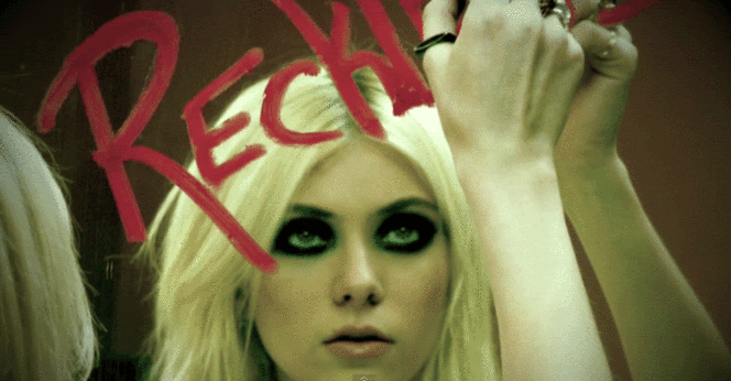
For the end of our video we liked the idea of painting our logo on the wall, as it went with our narrative and could be used as a backdrop for the performance:
Of course we also followed many basic music video conventions, noted by theorists like Andrew Goodwin, such as:
- More screen time for the lead singer
- Beauty Shots
- Equal screen time for both guitarist & bassist
- Star motifs – repeated shots of the band
- Cutting to the beat of the music
- Discontinuity & extremes – cutting from wide shots to very close-up shots
- Lip-singing & instrument playing
- Relationship between lyrics and visuals
- Visual trademarks/motifs e.g. our band logo, close-ups of mouths singing ‘You can call me X’, etc.
- Reference to the notion of looking & voyeurism – particularly important in our video
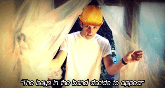 |
| An example of visuals relating to the lyrics - Josh is not actually in the band, but we do have a boy appearing at the same point as the singer says these words |
 |
| A beauty shot of our lead singer, a shot type used in most music videos, especially commercial ones |
WEBSITE

- Fan interactivity
- Merchandise
- Videos
- Playable music
- News
- Purchasing opportunities for the music
- Tour dates
- Gallery
- Artist biography
 |
| Paramore's scrolling site |
 |
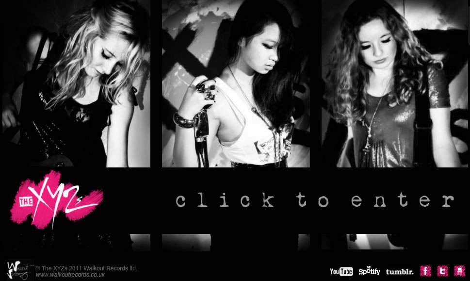
| Our fixed flash website |
Also, many sites have a forum or comment box so that fans can interact with the band, but as a fairly small, new band we thought we would do our main fan interaction through Social Networking sites, as fans are more likely to ‘tweet’ the members than try and reach them through their official forum nowadays.
After looking through lots of websites for artists with similar genres to ours, I particularly liked the grungy style of Avril Lavigne’s as it was rocky as well as still being quite girly. The font on her site was perfect for what we were going for, so we used a similar font on our own site.

DIGIPACK

For our album cover we followed most conventions, for example use of a mid-shot of all three of us (lead singer in the middle) with a clear album title and even larger band name. We followed the conventions of other girl rock bands, using direct address and quite serious, sultry shots.

We ensured to place all relevant institutional information, like record label, website and copyright, on the back cover as well as the album track names and a few more smaller photos, which is quite standard for a debut album. The two inside panels left more room for creativity, and we decided to use more sophisticated photos on one side to show a different side to the band, using lots of close-ups like many female groups do to focus on their appearance, unlike the back cover shots which show our instruments and look more edgy.
No comments:
Post a Comment