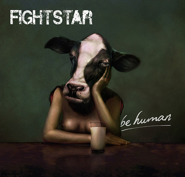
Fightstar - Be Human (2009)
Very attention-grabbing and slightly controversial. FIGHTSTAR font connotes ROCK. |
 |
S Club 7 - Sunshine (2002)
They are on all their album covers - means the band is focused on the image and personalities of its members. All smiling, looking friendly, dressed appropriately - parent friendly and aspirational to kids, their core market. |
 |
Everything Everything - Man Alive (2010)
Very abstract, arty and random. Suggests that band are pretty unique and weird (which they are). The font connotes a synth/electronic style. |
 |
Busted - Busted (2002)
Debut album - all about THEM, we need to see them. Aspirational to young boys - they have supposedly been arrested, making them seem cool and rebellious, and they are dressed in a skater-boy way that was fashionable at the time. The bad-boy image is also appealing to young guys who will fancy them and think they are exciting and dangerous, yet everyone knows they are harmless pop-fun so parents approve. |
 |
Blur - Blur (1997)
The band are already very popular and established by this point so they do not need to put themselves on or any clear genre signifiers, however it does suggest a cool indie vibe. A clever play on the album name and band name, blur - simple yet effective. |
 |
The Beatles - Magical Mystery Tour (1967)
This is the re-issue cover but the original cover is pretty similar. The bright colours and psychedelic style is appropriate to the hippy craze and drug-induced state The Beatles and many of their fans were in at the time - looks "trippy". It is also all about fun and light-heartedness, and is of course eye-catching, something important in the time of record stores. |
|
 |
Thom Yorke - The Eraser (2006)
The kind of abstract, creative cover we would expect from Radiohead's frontman, as they are known for keeping out of the spotlight themselves and being generally quite different. This won an album art award in 2006 and is made from cardboard rather than plastic to be environmentally friendly, something Yorke is also known for being. |
QUESTIONS:
1. What are the typical features an album cover has? - Mine all have the name of the artist and album on the front cover, as the majority of albums do.
- Most of them feature some kind of photography, or if not, artwork like Thom Yorke's and Damien Rice's.
- The back cover usually has the track names listed, barcode, and copyright/institutional information.
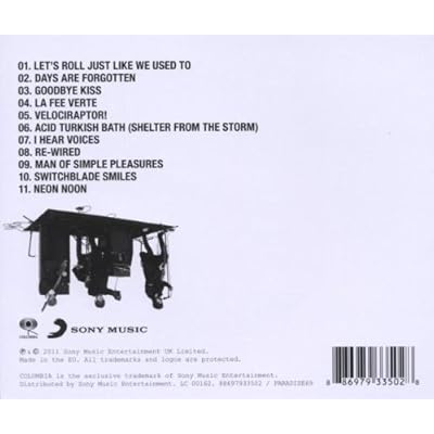 |
| An album back cover |
2. How would you categorise the covers? Are there any other ways of distinguishing between them other than generically? - I think there are three main categories: The photo/artwork is either 1) of the artist 2) reflective of the title 3) abstract
- You can also often distinguish album covers depending on whether they are for a debut album or for an established artist. For example, Thom Yorke does not need to put himself on his cover as by this point in his career everyone already knows him as the lead singer of Radiohead. Busted, however, have put themselves prominently on their cover for their debut.
3. Album covers serve many different functions. What do you think these are?
- To be "judged by its cover" - if you saw it in a store or on a website you might pick it up/find out more about it
- To appeal to the artist's target audience and possibly others - secondary markets
- To create a brand identity - artists often use similar styles/fonts etc. throughout each album release so fans recognise their brand
 |
| Mayday Parade create a strong sense of brand identity with their album covers which fans will always recognise |
- To physically protect the CD
- To signify/suggest the artist's style and genre
- To inform the buyer of the track names and order, plus any other information like date and record label
|


Just a thought, Busted's album cover is also a play on the name of the band, like blur's.. they've been busted... :)
ReplyDelete