I have chosen to analyse more closely
Busted's self-titled debut album from 2002 because it it designed with a clear target audience in mind and has lots of genre signifiers and typical album cover conventions.
FRONT COVER
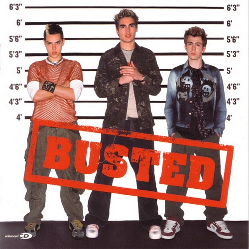 |
- The album/band title logo is big, bold and red. Quite masculine and strong - aimed mainly at boys but of course girls like them too.
- Shows the three band members clearly - the focus is on them, creating an identity.
- The set-up suggests they have been arrested, making them look like typically "bad boys" which will seem cool to kids.
- The whole police station theme also fits with the band/album name - they have literally been busted!
- They are dressed in casual, rocky-punky clothing with spiky dyed hair and expensive looking trainers - all very trendy at the time and aiming at kids with a taste for pop-rock.
BACK COVER |
 |
- Large, bold, uppercase writing - easy to read
- Same font as on the cover - sticking with style
- Same colour scheme of red, white and black throughout the cover
- Plain background - not too fussy or complicated
- Important institutional info at the bottom
|
INSIDE SLEEVES


No comments:
Post a Comment